Designing an improved finance application form for staff and customers
Role: Lead product designer
Company: Arnold Clark
Product Type: Web application
Problem
Arnold Clark, the UK’s largest independently owned car retailer, required a new product to handle their finance applications.
- The existing form was outdated in both process and design
- It was difficult to use, leading to a high number of errors being made
- The form didn’t have all the right fields to capture the information required
- The form could only be used by staff, not customers, so needed to be completed in-store
Discovery
Secondary reseach
To kick off, I carried out a set of secondary research, gathering data from both internal and external sources. This allowed me to quickly get a broad understanding of how customers felt about buying and financing a car online. Some key insights included:
- The number of car buyers interested in purchasing online has increased since the pandemic
- The preferred path to purchase includes being able to perform key car-buying steps online
- The more of the process the consumer can complete online, in the comfort of their own homes, the less overwhelming they’ll find it
- There is appetite among consumers to arrange finance online, with many saying they’d want little to no human support during the process
Competitor analysis
Another step in the discovery was competitor analysis, looking at the finance application process used by other car retailers; CarFinance247, Cazoo, CarMoney, Motorly, Zuto, MyCarCredit, Oodle, Peter Vardy Cars and Cinch.
This allowed me to identify common patterns and understand user expectations. Most of these competitors already had a smooth online process, further establishing the user need and expectation of being able to buy a car with finance online.

A snapshot of the competitor analysis
User interviews
I planned and conducted 12 interviews with users of the existing form, then planned and facilitated the collaborative analysis workshop, as well as contributing design insight.
Focusing on the current experience, insights showed that:
- Users found the form confusing and hard to use
- Established users had adopted workarounds to bypass parts of the form where it didn’t work as required or expected
- Fields needed to capture required data were missing
- Some users weren’t sure of the criteria for certain questions, and there was no guidance in the system to help with this
- Not being able to save progress was a particular pain point

“The form doesn’t let me enter the information about the customer’s extra income, so I just have to put it as a note in the system and hope the finance team add it when they do the calculations.”
Objectives
Using all of the insights gathered, I identified user needs and created statements for both user types.

As someone looking to finance my car purchase online, I need a seamless and self-guided finance application process, so I can complete it comfortably from home without feeling pressured by in-person interactions.

As a sales staff member helping customers with financing, I need an intuitive, guided finance application form with clear criteria and data requirements, so I can efficiently support customers without resorting to workarounds or risking lost progress.
These statements could be referred back to when defining product objectives.
- Create a new user-centred form that is accurate, intuitive and easy to use
- Design the user experience to cater for both staff and customers
- Decrease form completion time
- Decrease the amount of errors made
- Allow application progress to be shown and saved
Ideation and design
Wireframes
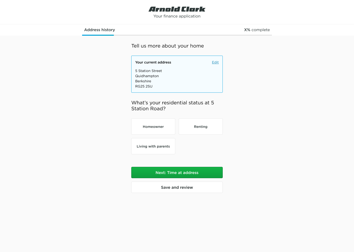
For rapid ideation, I created wireframes based on the insights gathered so far. These were designed using Arnold Clark’s design system, incorporating patterns used across their products.
The new form followed a “one thing per page” format. Breaking down complex forms into multiple pages is a well-documented industry standard. Multi-page forms improve data quality and completion rates by reducing cognitive load. In behavioural science, the “goal gradient effect” suggests that users become more motivated as they progress, speeding up form completion.
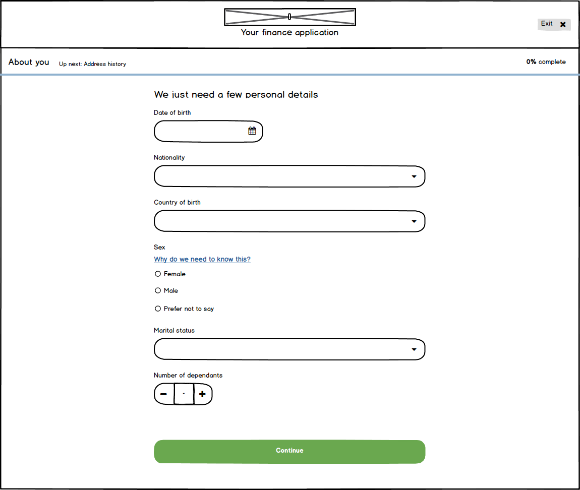
An example of some of the wireframes created using Balsamiq
Usability testing with staff
So I could further refine the design of the new form, I ran some task based usability tests with 5 existing users. I used the wireframes for these tests in order to avoid bias caused by the aesthetic usability effect.
Overall, the new design performed well with notable insights being:
- The participants immediately understood the new format and commented positively on it
- Two of the participants mentioned there were things that were new to them, but said they would get used to it the more they used it
- The progress bar was mentioned favourably by all participants
- A change was needed to employment section, to allow users to search by postcode for their workplace

User interface design
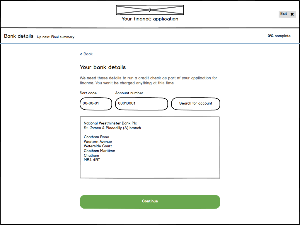
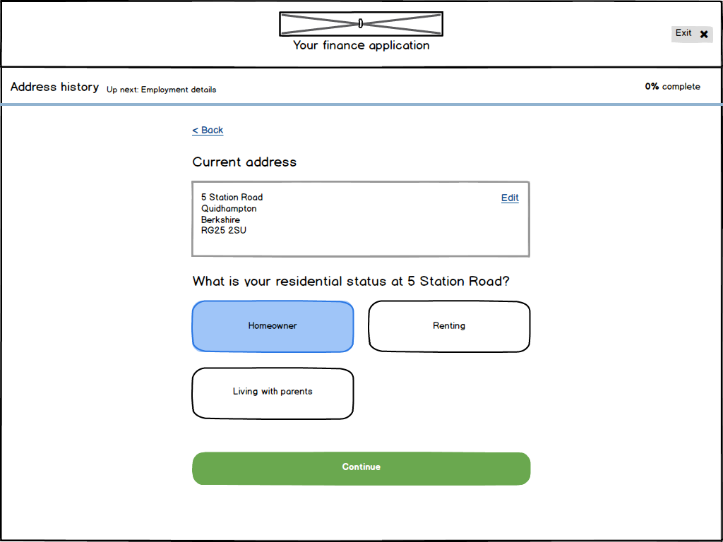
Confident in the solution following my discovery and usability testing, I designed the new screens using our design system components. The changes identified in the first round of usability testing were incorporated at this stage.
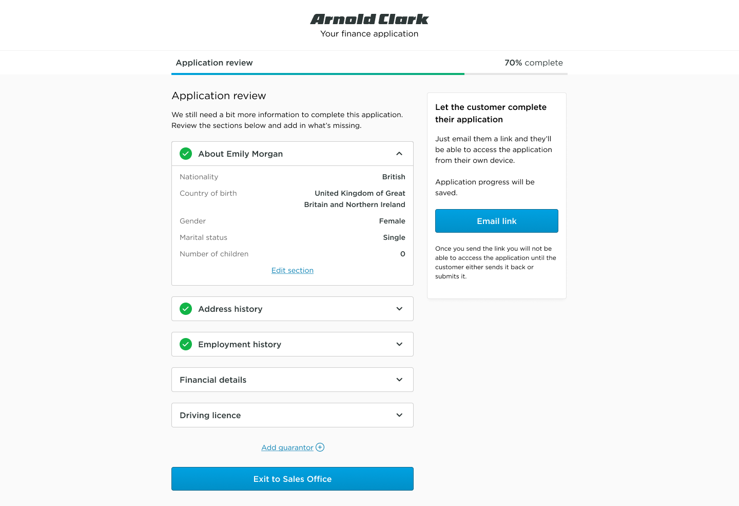
An example of some of the screens created using Figma
Usability testing with customers
Since the new form is also intended to be used by customers, I carried out further usability tests with members of the public. The design was positively received and the participants had a good level of understanding in how they thought the app was used. Key insights:
- All participants understood how to complete and submit their applications
- Green ticks and the progress bar effectively communicated which sections were complete and what remained
- Feedback praised the clarity, simplicity, and professional design of the interface
- Further work was needed to clarify the next steps in the application process, and to make instructions more explicit to reduce user uncertainty

“It’s simple, it’s clear, and I can work out what I need to do.”
“I love how simple it looks, it’s professional and easy to understand.”
These insights fed into the next iteration of the design, which was then taken into development. I worked closely with the engineers to ensure the design was implemented as intended.
Experimentation
In-store pilot
The new application form was tested at an Arnold Clark store as part of a pilot. I attended the store to observe and gather feedback as it was being used.
- The product was successful in its purpose, with 14/15 applications being completed with no issue
- The one unsuccessful application was down to a technical bug, rather that a failing of the product itself
- All users but one expressed they were happy with the new application form
- The pilot was integral in us discovering some technical issues that have now been resolved, as well as some ways we can make the application even more efficient for users.
Results and impact
The redesigned finance application form delivered significant improvements in usability and data accuracy, achieving the following outcomes:
- Decreased error rates: Streamlined input fields and real-time validation features resulted in a 66% reduction in application errors, minimising the need for manual corrections by staff.
- Improved data quality: Clearer instructions and intuitive field formatting increased the accuracy of submitted information, ensuring that more applications were processed successfully on the first attempt.
- Enhanced user satisfaction: Post-launch surveys showed that 92% of users found the new form clearer and more efficient, with special mention of features like tooltips and error prevention mechanisms.
- Future readiness: The design’s adaptability for both internal staff and external customers positions the product for successful scaling to the website in the near future.
These results highlight how focusing on accuracy and user needs can enhance operational efficiency while preparing for future expansion.