Redesigning Slimming World's Consultant Portal
Role: Lead product designer
Company: Slimming World
Product Type: Website / Intranet
Problem
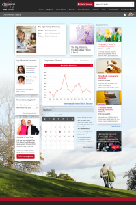
Our World is Slimming World’s website for Consultants, designed to support them in running their business. Initially, it functioned as a library of written information with 24/7 availability. Over time, however, the platform’s purpose evolved, and it no longer adequately meets user needs. Consultants face challenges such as:
- High cognitive load
- Lack of consistency and visual hierarchy
- Ineffective navigation and search functionality
- No user feedback mechanisms
- Failing to meet WCAG accessibility standards.
Recognising these issues, Slimming World embarked on a redevelopment project, and I took on the role of lead product designer.
Discovery
Heuristic evaluation and accessibility review
I conducted a comprehensive review of the platform, benchmarking it against Jakob Nielsen’s Usability Heuristics and WCAG guidelines. Key findings included:
- Non-compliance with WCAG accessibility standards
- Poor typographic hierarchy and visual design
- Ineffective search functionality
- Lack of feedback mechanisms for users
The outcomes were shared with stakeholders, accompanied by actionable recommendations.
User research
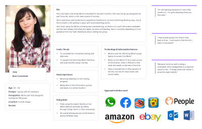
To understand user perspectives, I initiated a survey through Our World. This survey identified key pain points and allowed users to opt into future research activities. Follow-up interviews were conducted with participants representing four user groups:
- New consultant: User’s who have joined Slimming World as a consultant within the last year
- Established consultant: Users who have been working as a Slimming World consultant for at least a year
- Team developer: An established consultant who manages other consultants
- District manager: A member of Slimming World staff who supports consultants and team developers
These user types guided the development of user journeys, content strategies, and design decisions.
Card sorting
The site’s growth over time led to a disorganised structure. To address this, I conducted closed card sorting sessions – both online and in-person – to gather insights into how users categorised content. These results informed the creation of a new site map.
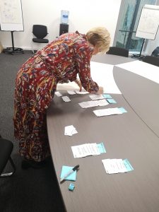
Everyone loves sharpies and post-its
Ideation and design
Proposed navigation and site structure
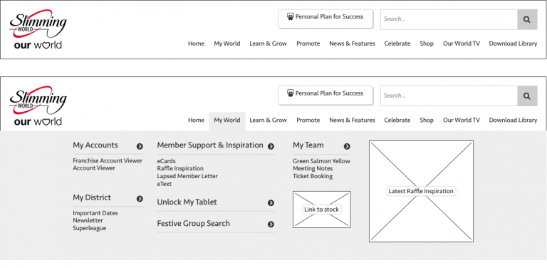
The initial proposed site navigation
Wireframes
Whist planning the testing activities, I’d also been working on identifying key page types that would become templates for the new site.
Low fidelity wireframes for each page type have been created using Balsamiq, indicating content types and placement. These will then go on to be tested by users and refined accordingly.
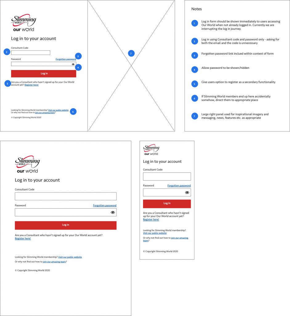
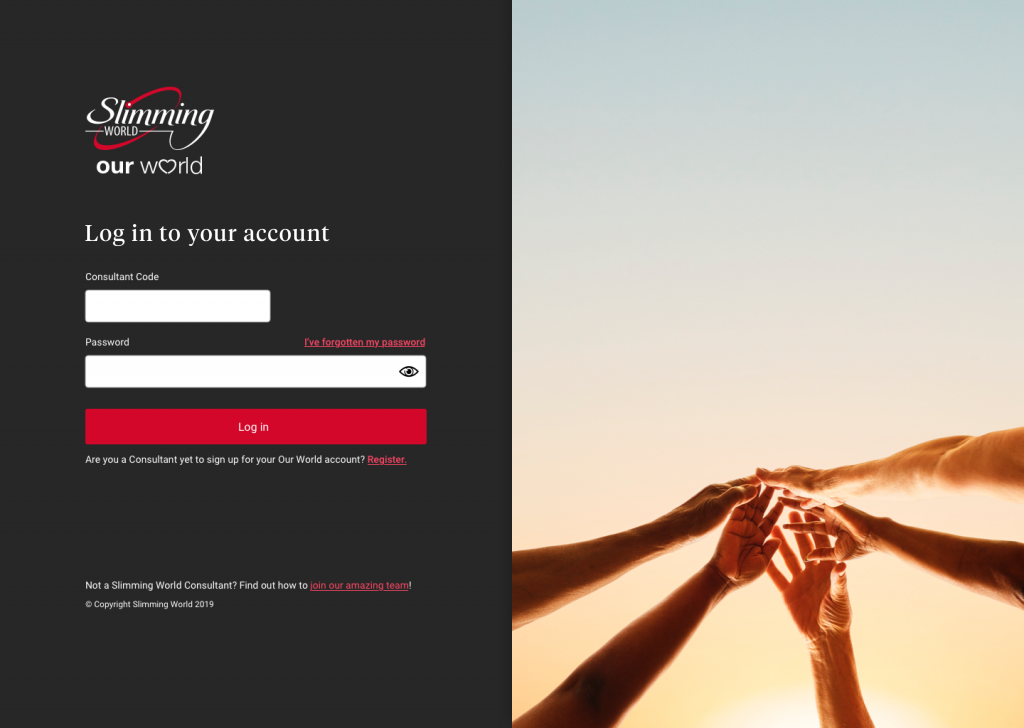
Initial wireframes for the new log in screen
User interface design
Adhering to Slimming World’s corporate brand guidelines, I developed conceptual designs based on the validated wireframes.
These designs emphasised simplicity, accessibility, and alignment with user needs. While additional discovery and testing were planned, initial designs showcased a clear direction for the platform’s evolution.
Results and impact
By the time I left Slimming World, the project was still ongoing. I made significant progress in addressing key pain points:
- Developed a user-centred navigation structure
- Created wireframes that prioritise usability and accessibility
- Enhanced collaboration with stakeholders through iterative feedback loops.
This leaves the project in a good place to be continued by others. Future steps include finalising UI designs and conducting further activities to ensure the platform’s success, including tree testing and usability testing.
